
Case Study · Rebrand · Brand Identity
Rebranding J&J Enterprises — 30 years of trust, a new mark to match.
01The Brief
Three decades of trust, a logo that didn't show it.
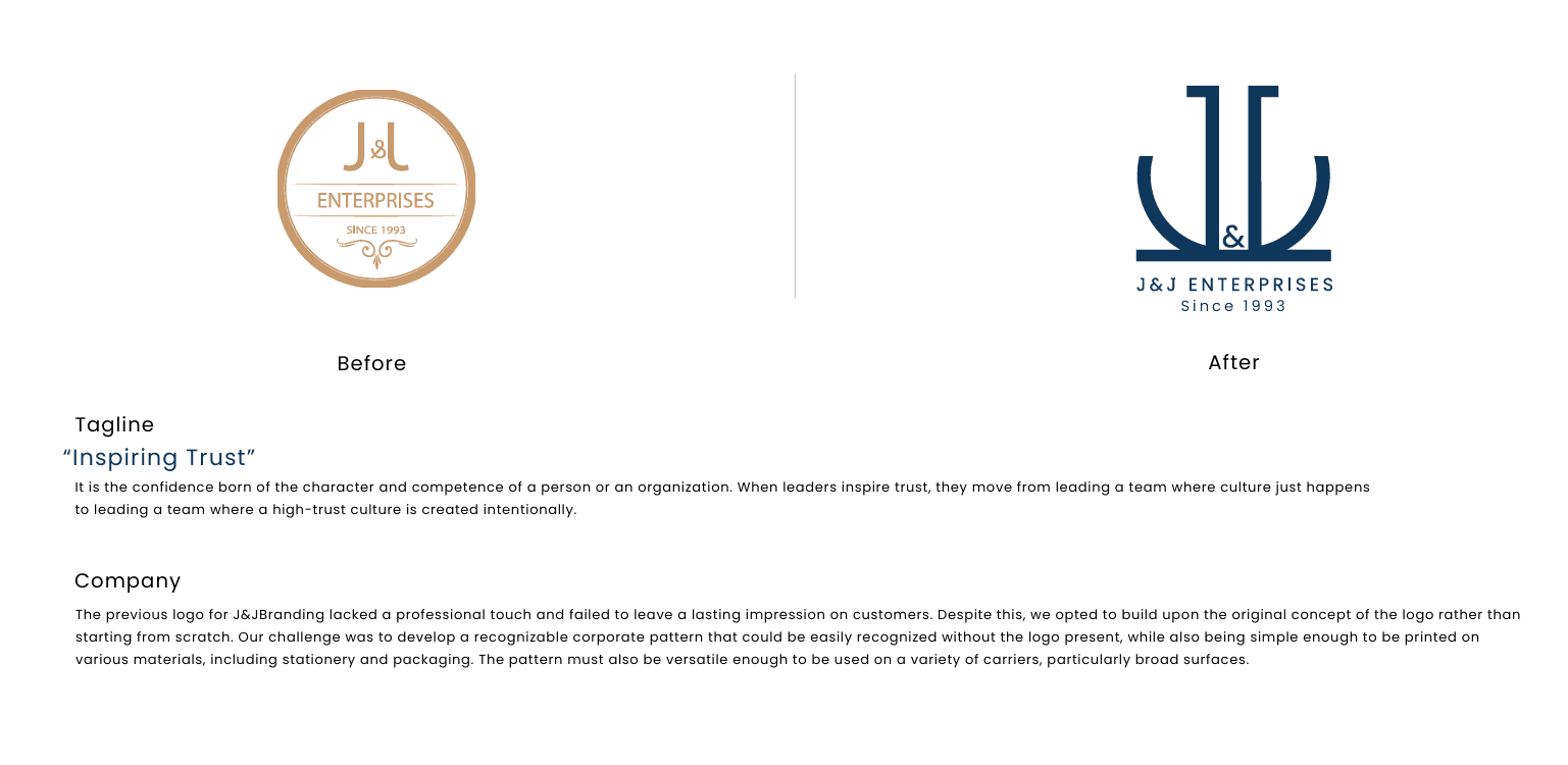
J&J Enterprises has been building its name since 1993 — but its previous logo lacked a professional touch and failed to leave a lasting impression on customers.
Rather than starting from scratch, we chose to build on the original concept of the logo. The challenge was to create a recognisable corporate identity and pattern — one that could be recognised even without the logo present, while staying simple enough to print on stationery and packaging and versatile enough for broad surfaces.
- 01Look professional
A refined mark worthy of 30 years in business.
- 02Keep the legacy
Evolve the original concept instead of replacing it.
- 03Own a pattern
A corporate pattern recognisable without the logo.
- 04Print anywhere
Simple enough for stationery, packaging and large surfaces.
“Inspiring Trust”
Trust is the confidence born of character and competence —
and J&J creates it intentionally, in every deal.
02Strategy
Evolution, not revolution.
Customers already trusted J&J. Our job was to give that trust a face — keeping the familiar spirit of the old badge while making it sharper, more confident and more corporate.
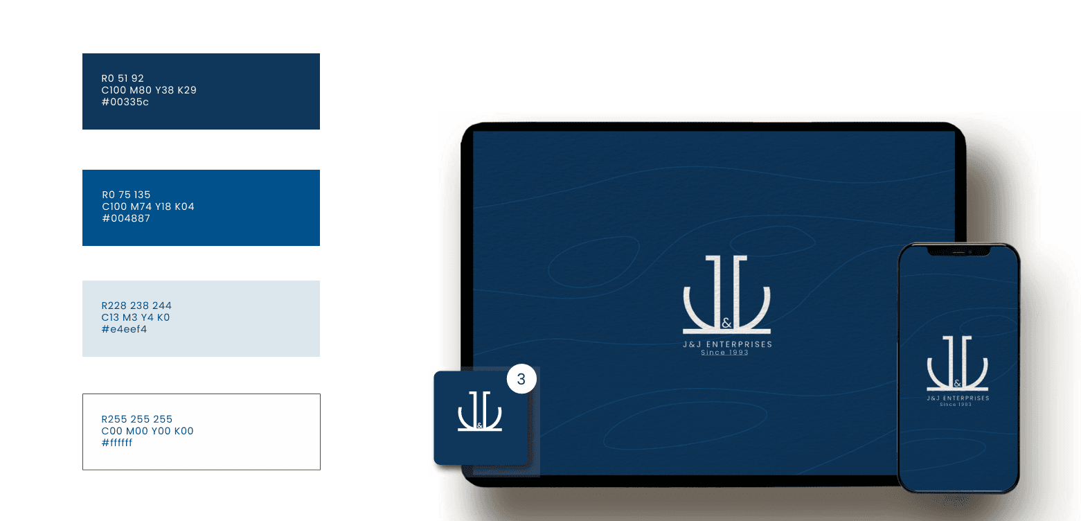
The brand idea “Inspiring Trust” guided every decision, from the steady, grounded shape of the emblem to the deep navy palette.
Confidence earned over three decades.
Proudly serving since 1993.
Always moving toward the next level.
Honest, dependable dealings.
Expertise customers can rely on.
03The Logo
Letter J + pathway — a way to success.
The new emblem combines two J letterforms with a pathway arrow — a symbol of the road to success that J&J has travelled since 1993.
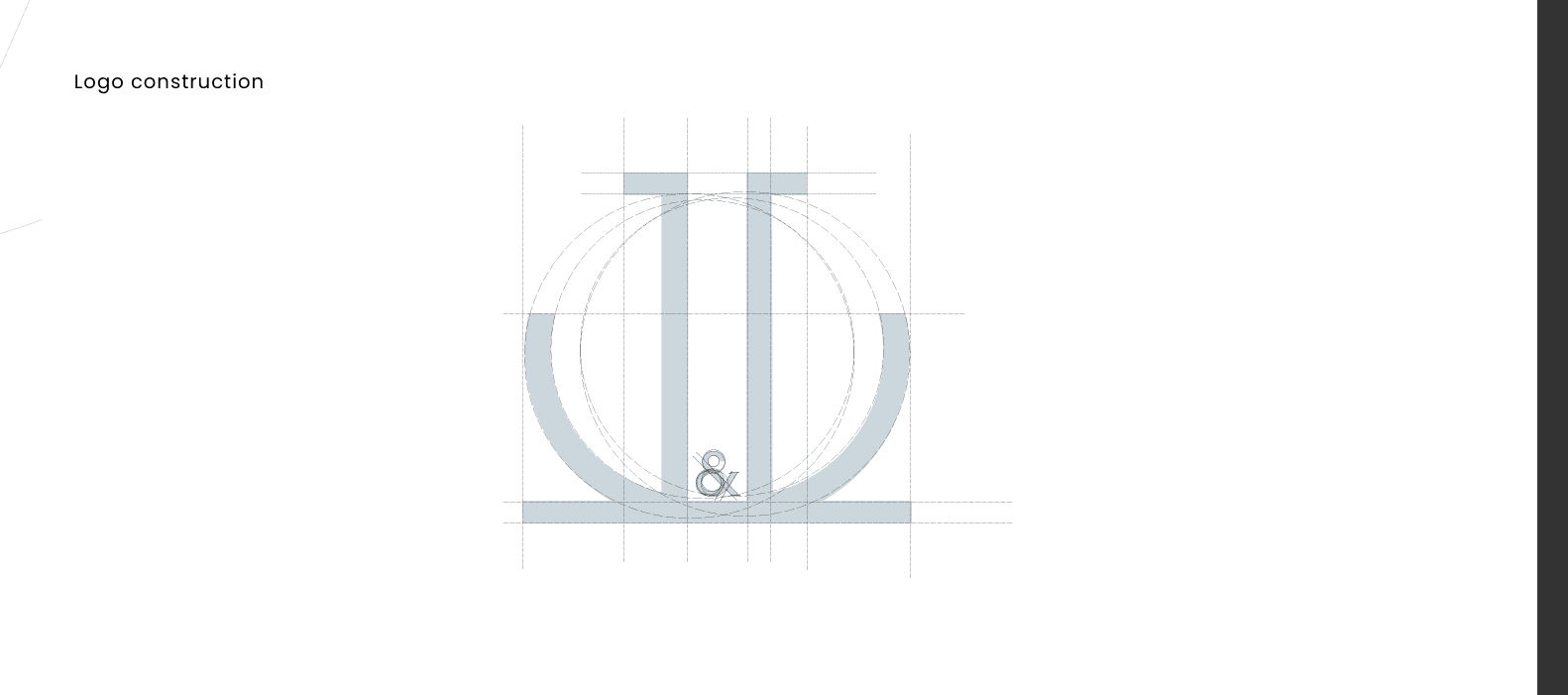
The two Js stand on a strong shared base with the ampersand between them, forming a stable, symmetrical mark that reads as partnership and foundation — and scales cleanly from a business card to a building wall.
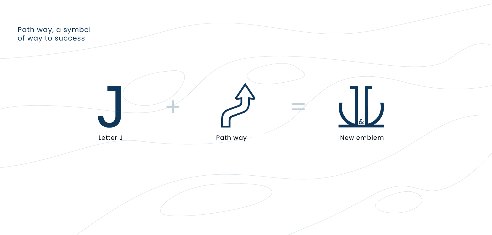
Symmetrical letterforms for partnership and balance.
An upward route — the way to success.
A solid foundation built over 30 years.
The link between the brand and its customers.
04Logo System & Stationery
A complete system, on every page.
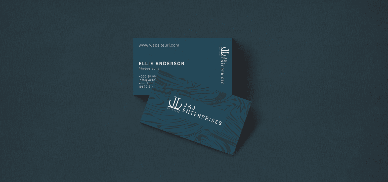
We built a full logo system — construction grid, horizontal, stacked and circular versions — and carried it across business cards, notebooks and print.
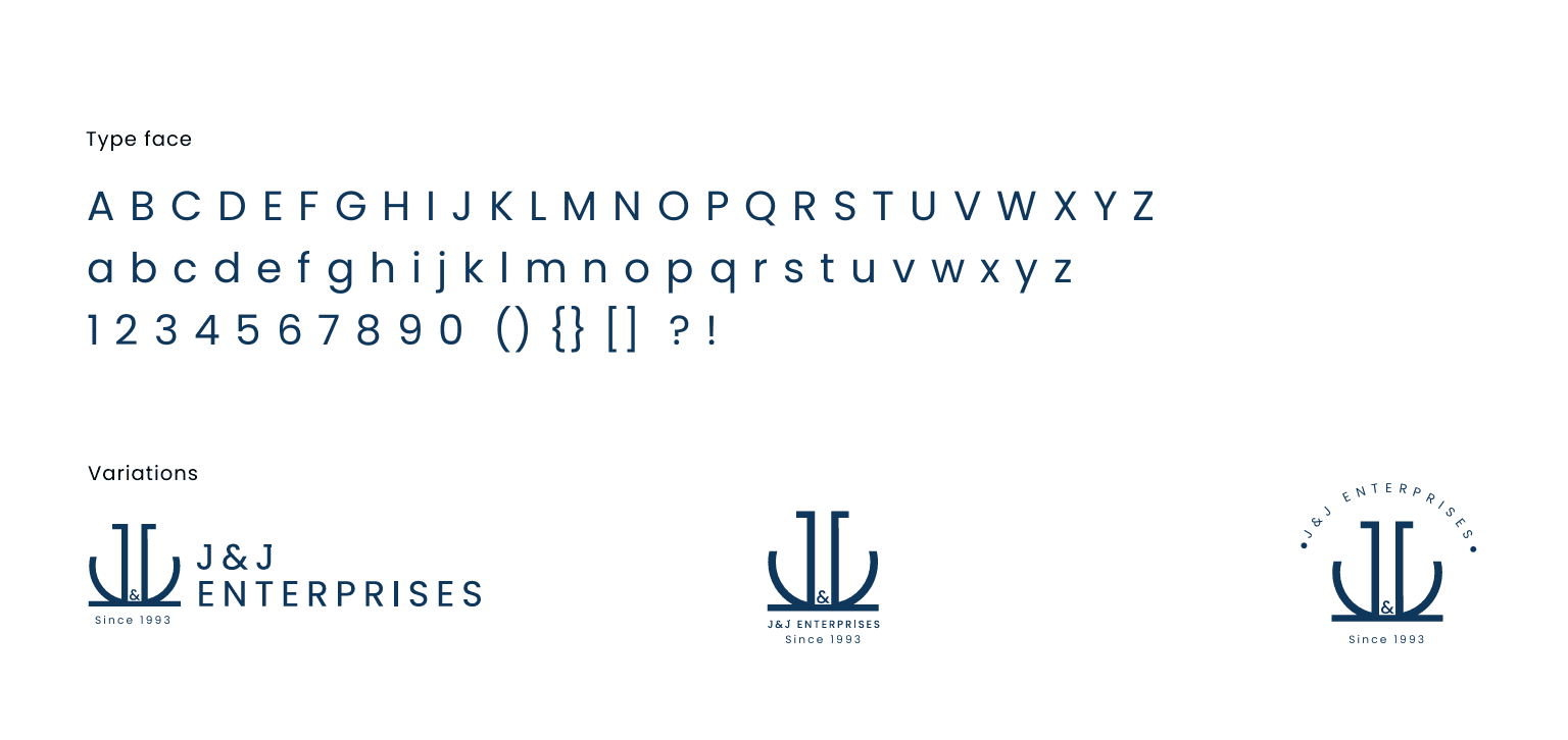
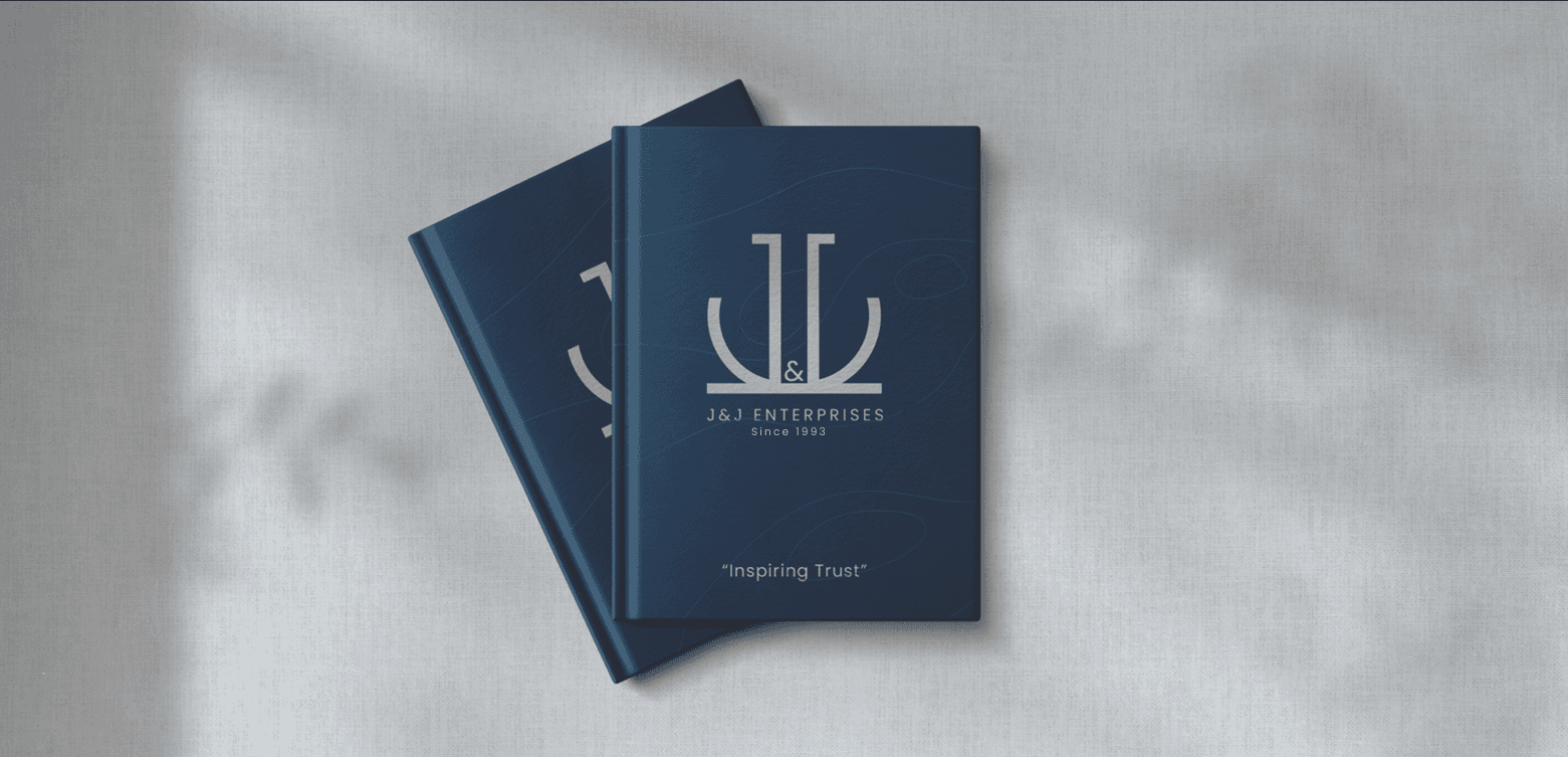
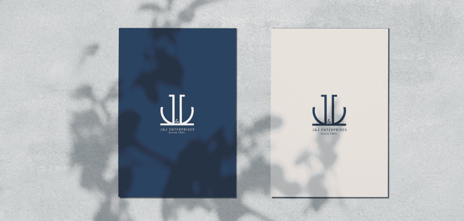
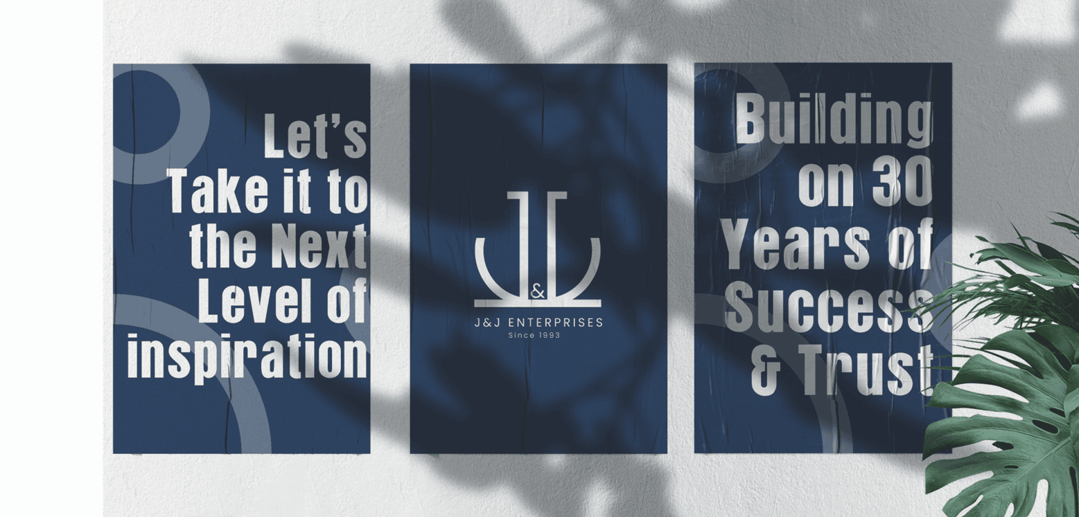
Horizontal, stacked and circular versions for every format.
Contour lines that identify J&J without the logo.
Simple shapes that reproduce on any material.
05Brand in the World
From the office wall to the team's uniform.
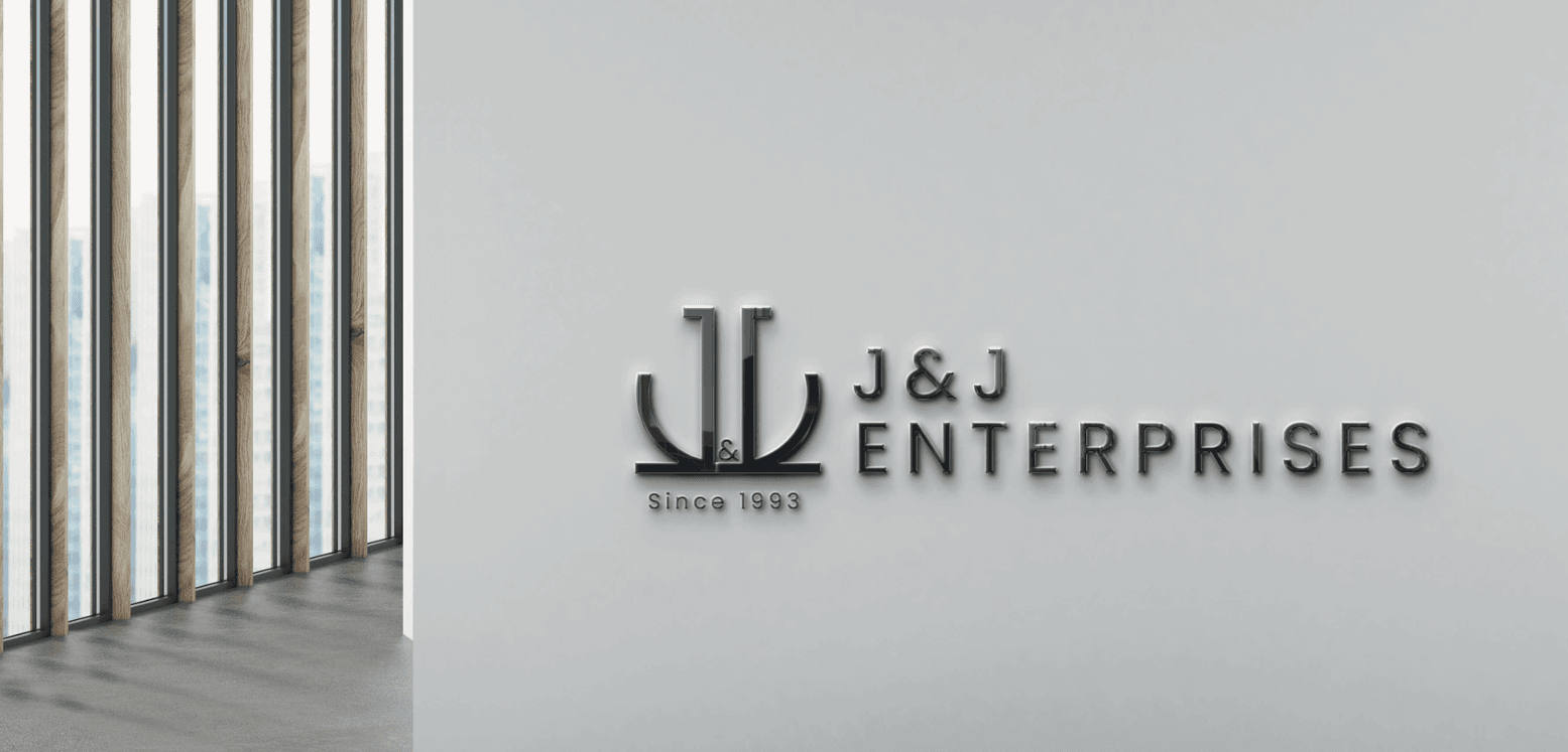
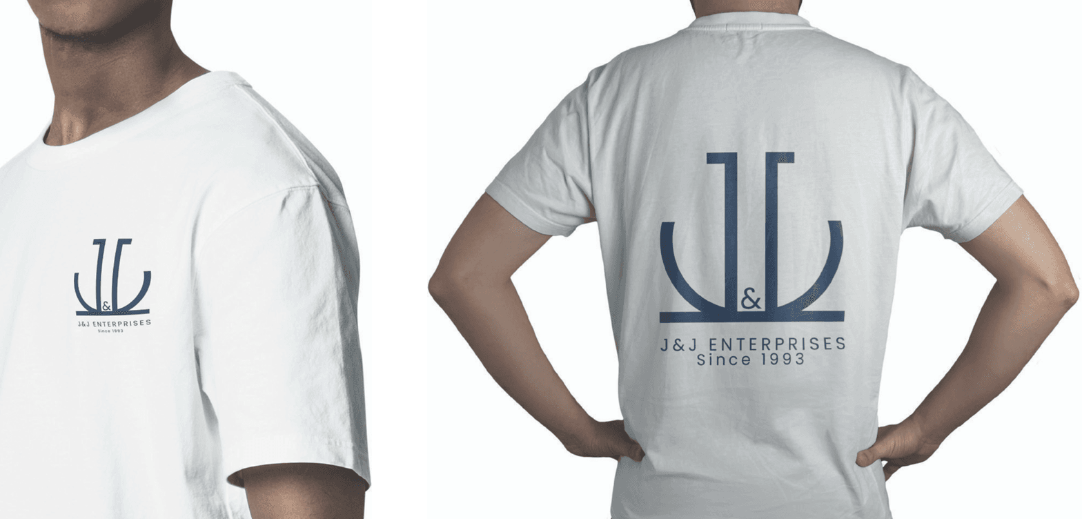
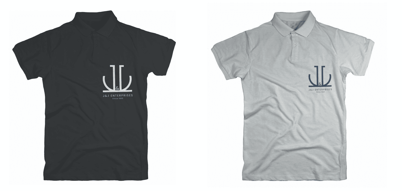
The identity now carries through office signage, staff uniforms, digital screens and brand imagery — giving J&J one consistent, trustworthy presence.
The Result
A legacy brand with a mark that finally matches its reputation.
J&J Enterprises now has a professional, meaningful identity — an emblem built on its original concept, a signature pattern and a deep navy palette — ready to inspire trust for the next 30 years.
What we delivered
Reputed Works
Brands that trust Dableyu.
From jewellers and cafés to hospitals and fashion labels — a few of the brands we’ve built, launched and grown.
Drag or scroll to explore.












Work with Dableyu
Ready to build a brand people remember?
From strategy to shelf, we engineer brands that stand out in crowded markets and grow with your business.
Start your brand project