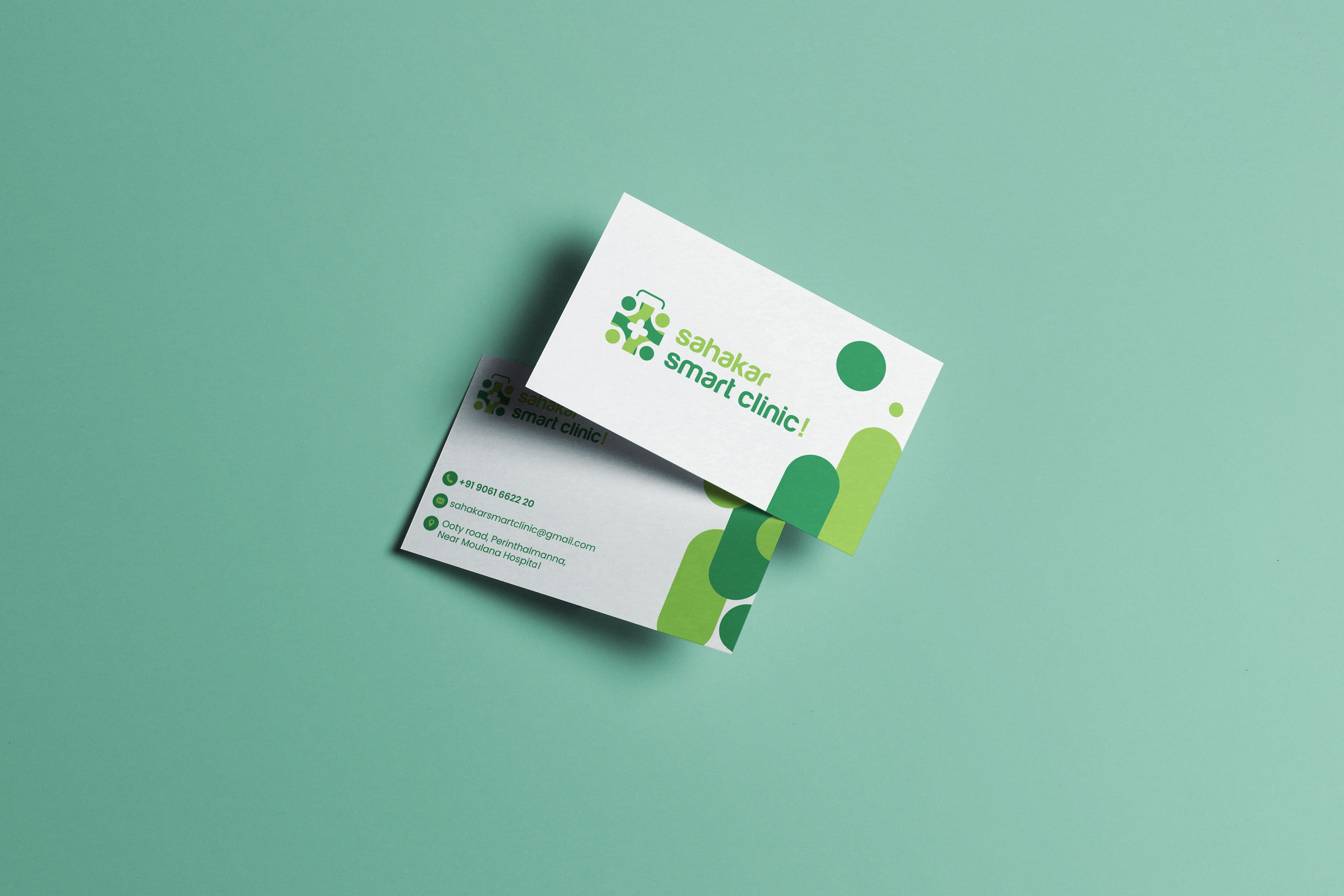
Case Study · Healthcare Brand Identity
Care that feels closer to home — Sahakar Smart Clinic.
01The Brief
Healthcare made clear and approachable.
Sahakar Smart Clinic brings clinic care, diagnostic services and homecare messaging together under one recognisable brand.
The visual system needed to feel reassuring and professional while staying easy to recognise across service information, printed materials and public-facing campaigns. A fresh green palette and a clear, people-centred symbol give the clinic a friendly identity without losing its medical credibility.
- 01Build confidence
Use a clean, professional look for a healthcare setting.
- 02Feel approachable
Bring warmth and humanity into the clinic's visual language.
- 03Stay recognisable
Make the logo and colours work across print and promotion.
- 04Explain services
Present clinic, diagnostic and homecare information clearly.
“We serve you well”
A welcoming promise carried across the clinic's
service communication and homecare campaigns.
02Strategy
A brighter kind of healthcare identity.
The identity pairs a confident medical green with a lively lime accent to make clinic communication feel fresh, warm and easy to navigate.
The logo brings a medical cross together with a human, connected form — a simple mark that stays legible on stationery, campaign artwork and smaller applications.
Put people and their wellbeing at the centre.
Make services and information easy to follow.
Use a consistent, professional visual system.
Carry one identity from clinic materials to homecare campaigns.
03The Logo
A medical cross, surrounded by care.
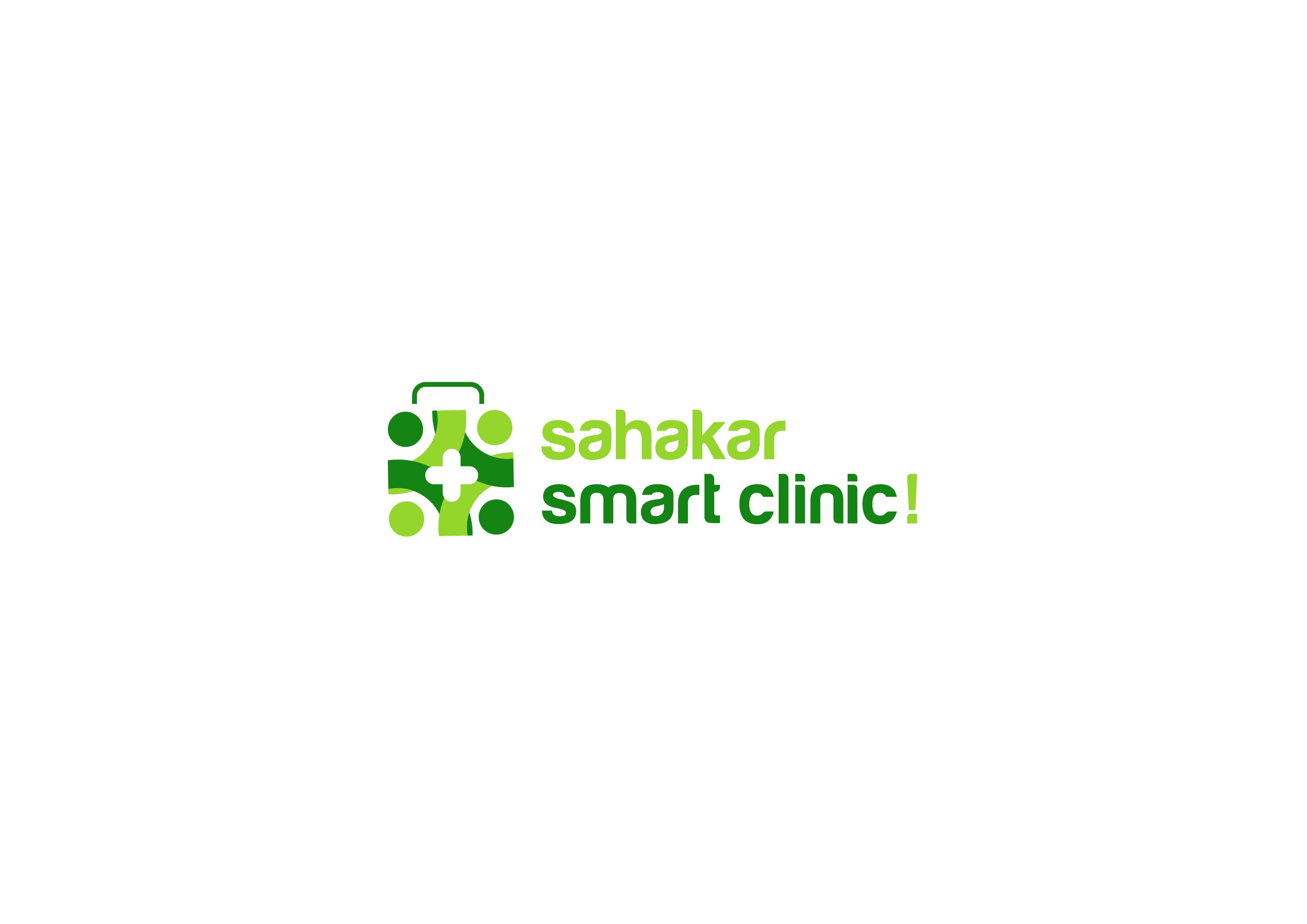
The Sahakar Smart Clinic mark combines a central medical cross with a rounded, people-inspired symbol, bringing healthcare and human connection into one compact identity.
The bold wordmark and bright green colour pairings keep the identity visible across light and dark backgrounds, from a clean logo lockup to larger campaign layouts.
A clear signifier of healthcare and clinical support.
Rounded forms bring a sense of connection and community.
Deep green and lime create a fresh, energetic palette.
A bold wordmark keeps the clinic name easy to read.
04Stationery & Service Information
Useful information, beautifully organised.
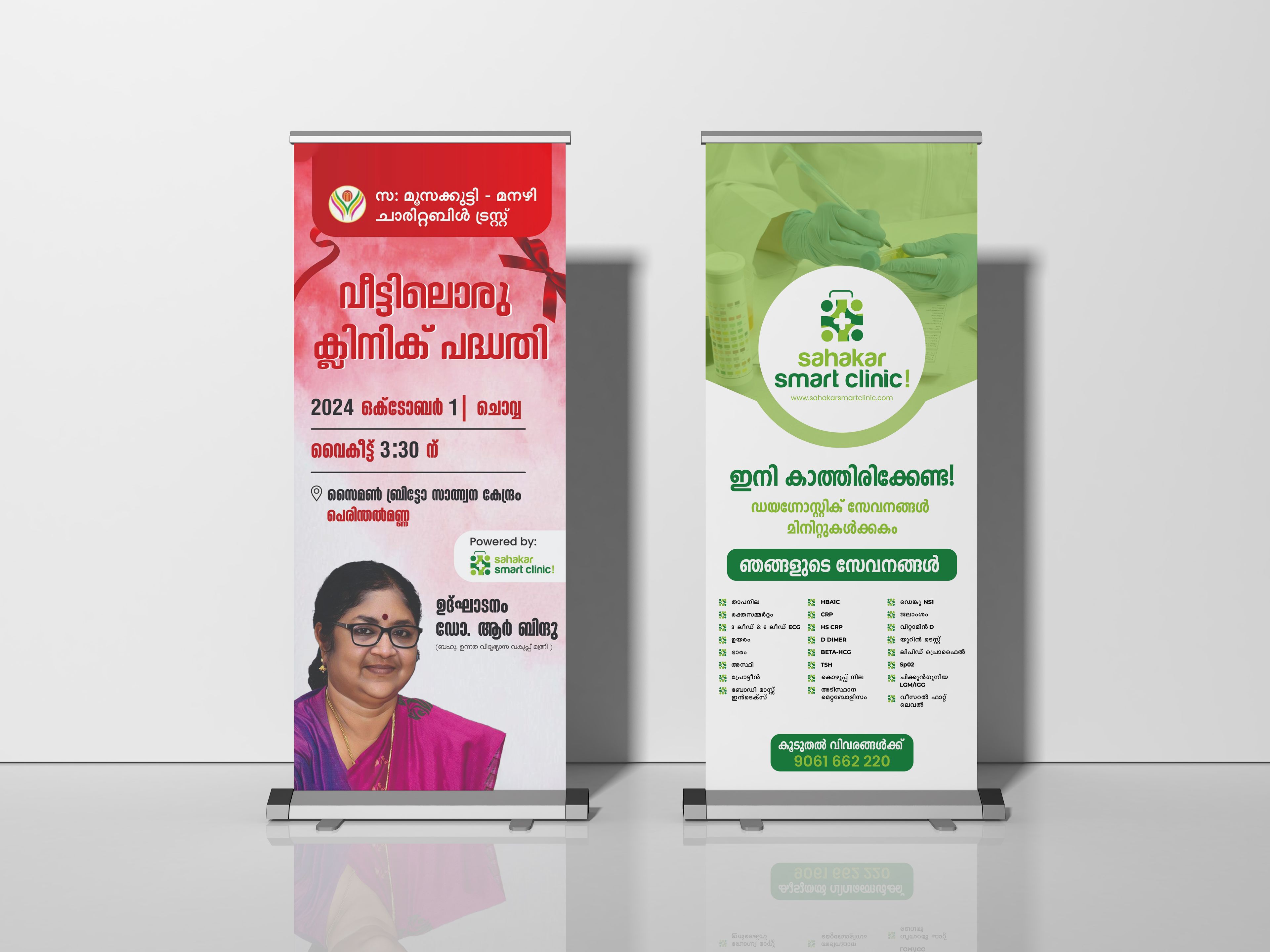
Clinic stationery and service collateral apply the identity to everyday communication, with clear layouts and the signature green-and-lime palette.
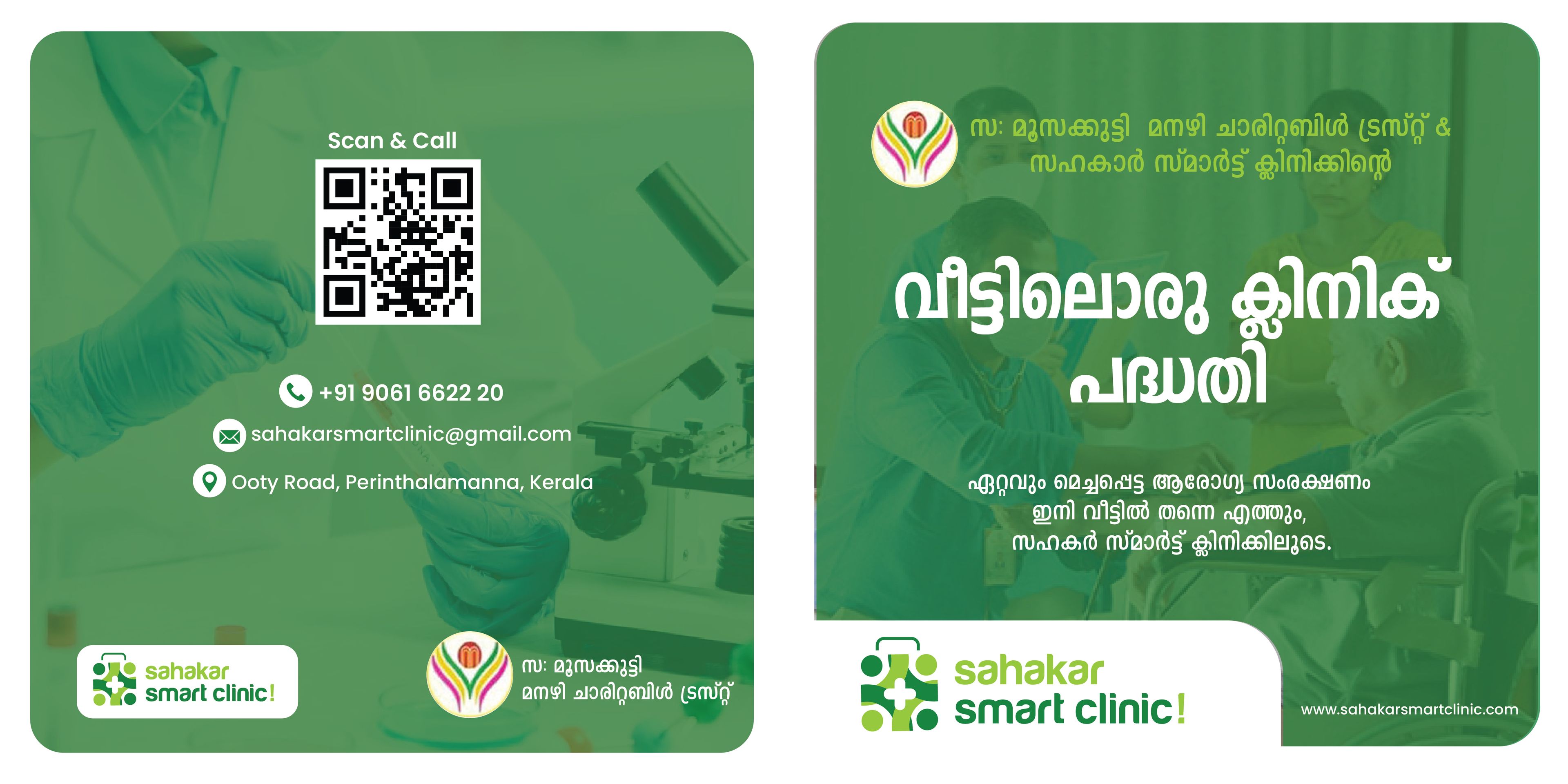
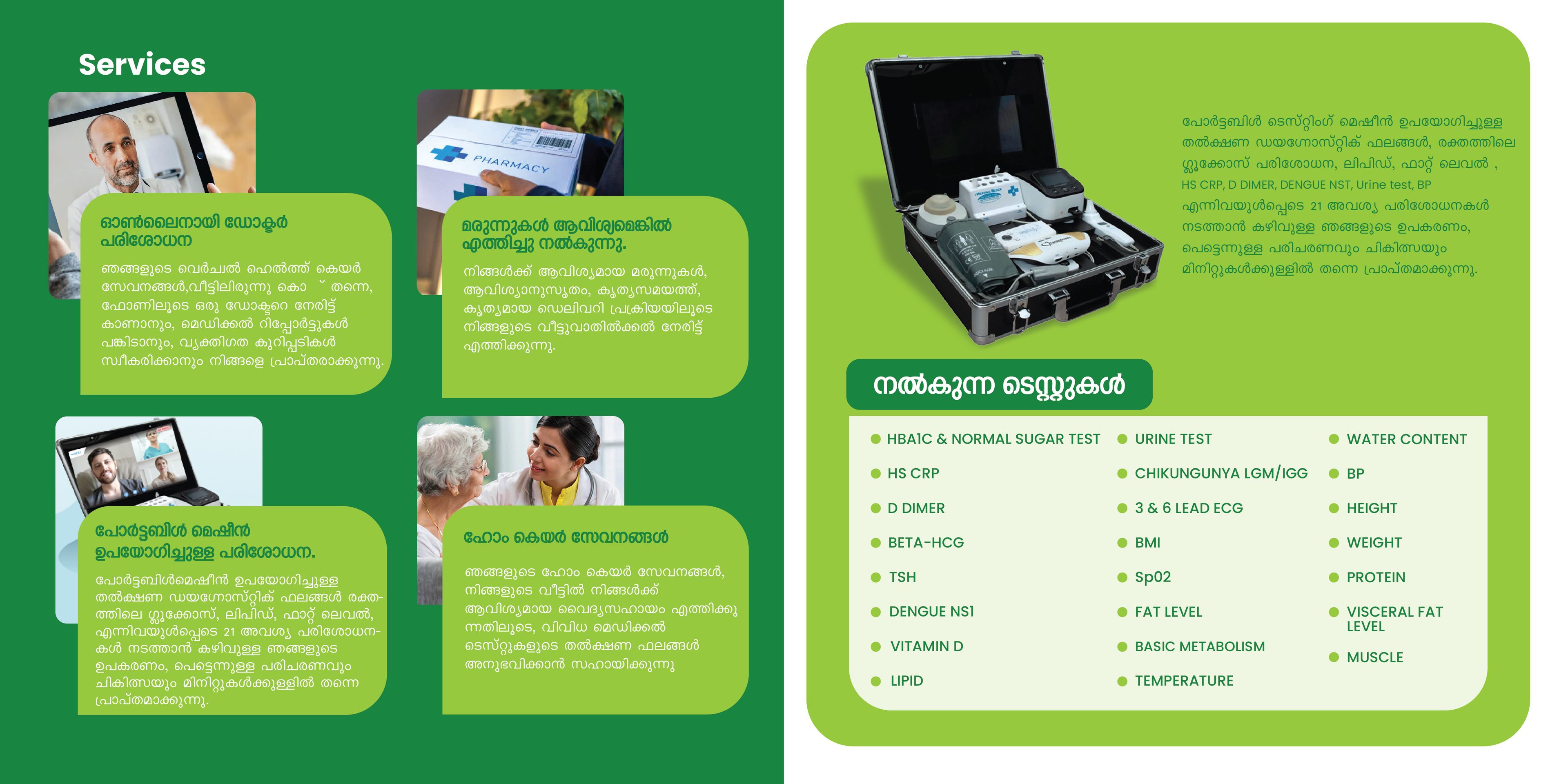
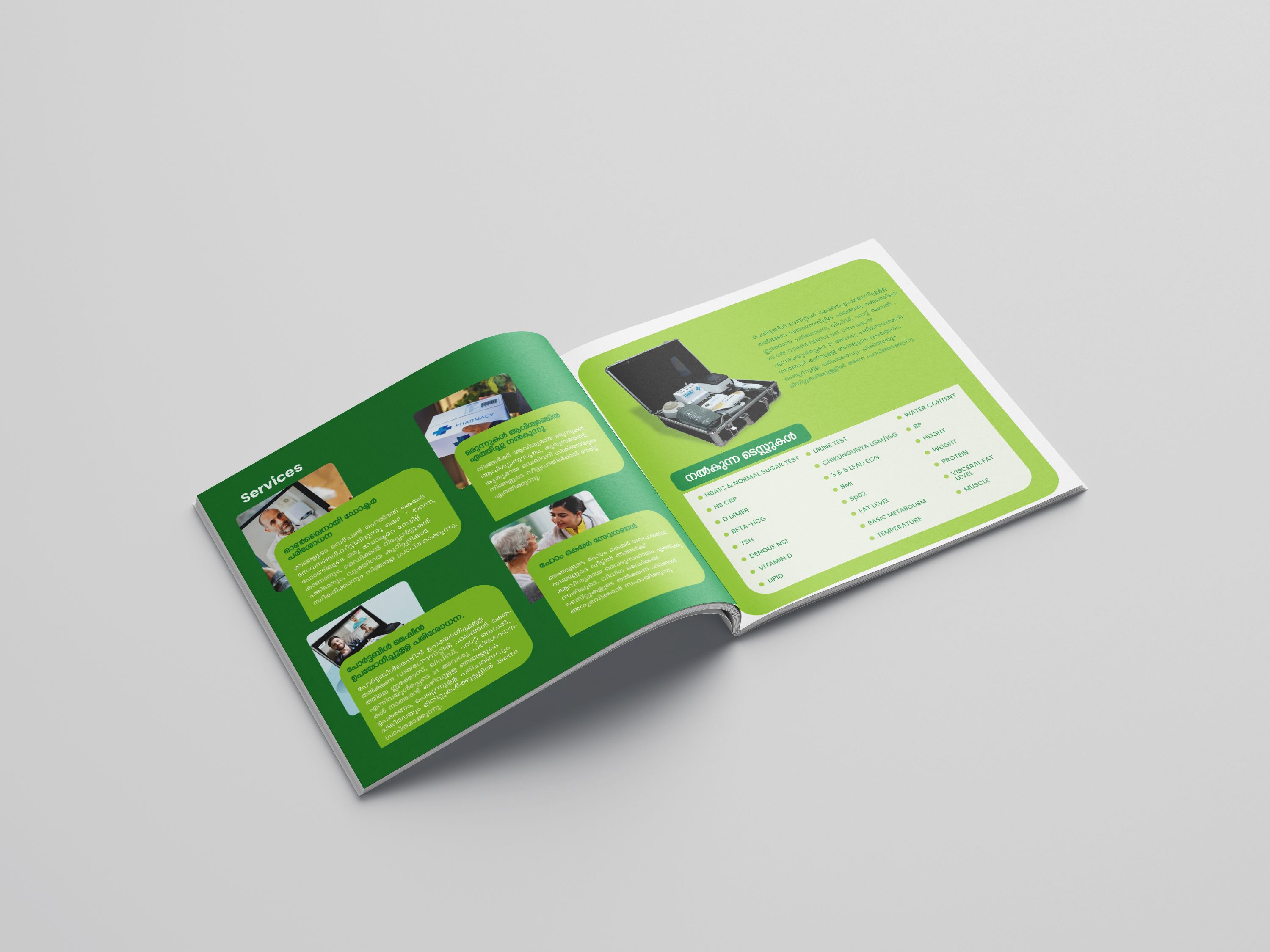
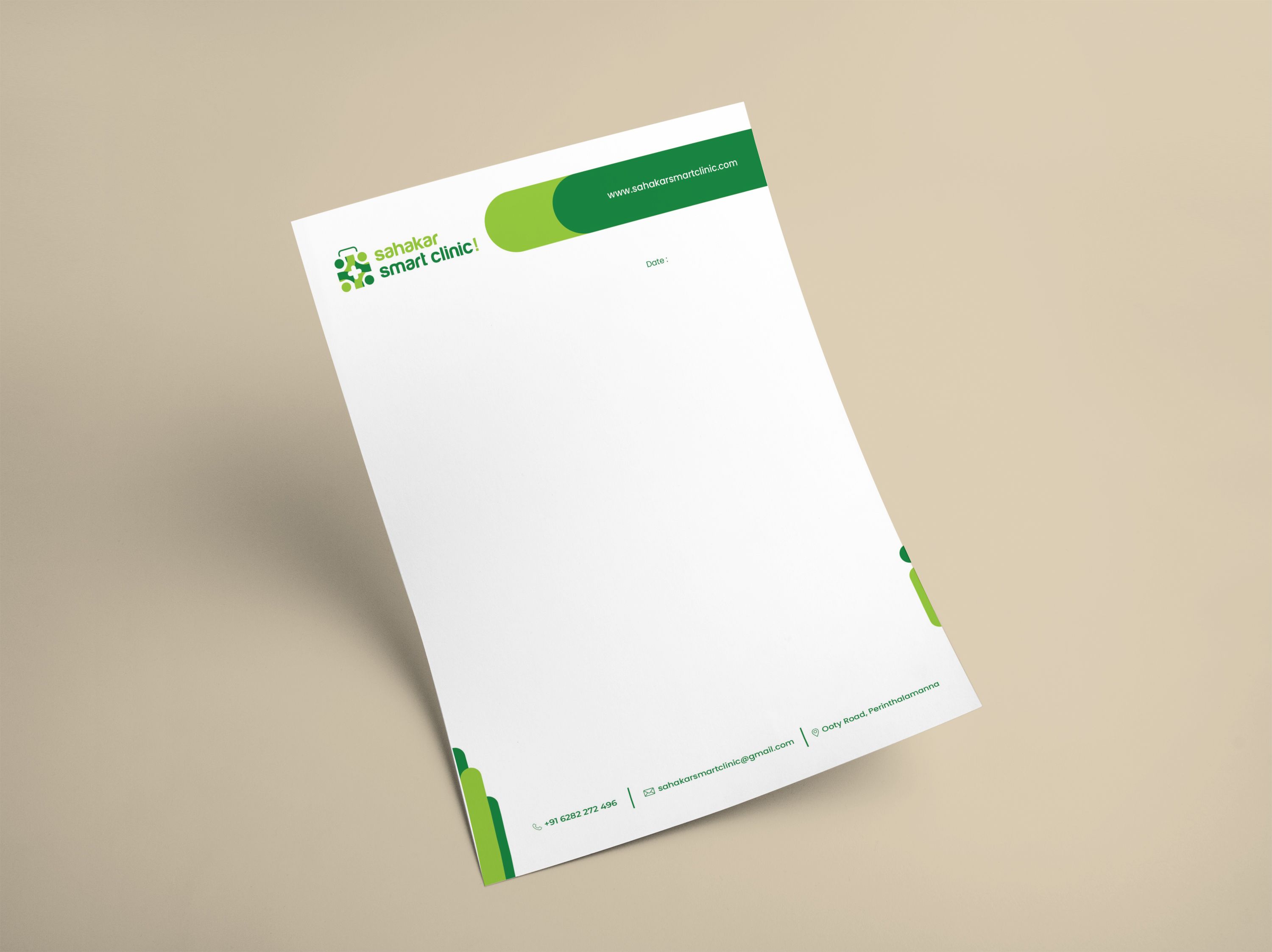
The clinic logo and colours carry through each printed piece.
Distinct headings and grouped information make services easier to scan.
The graphic language adapts to both stationery and larger-format layouts.
05Brand in the World
A consistent presence, where care happens.
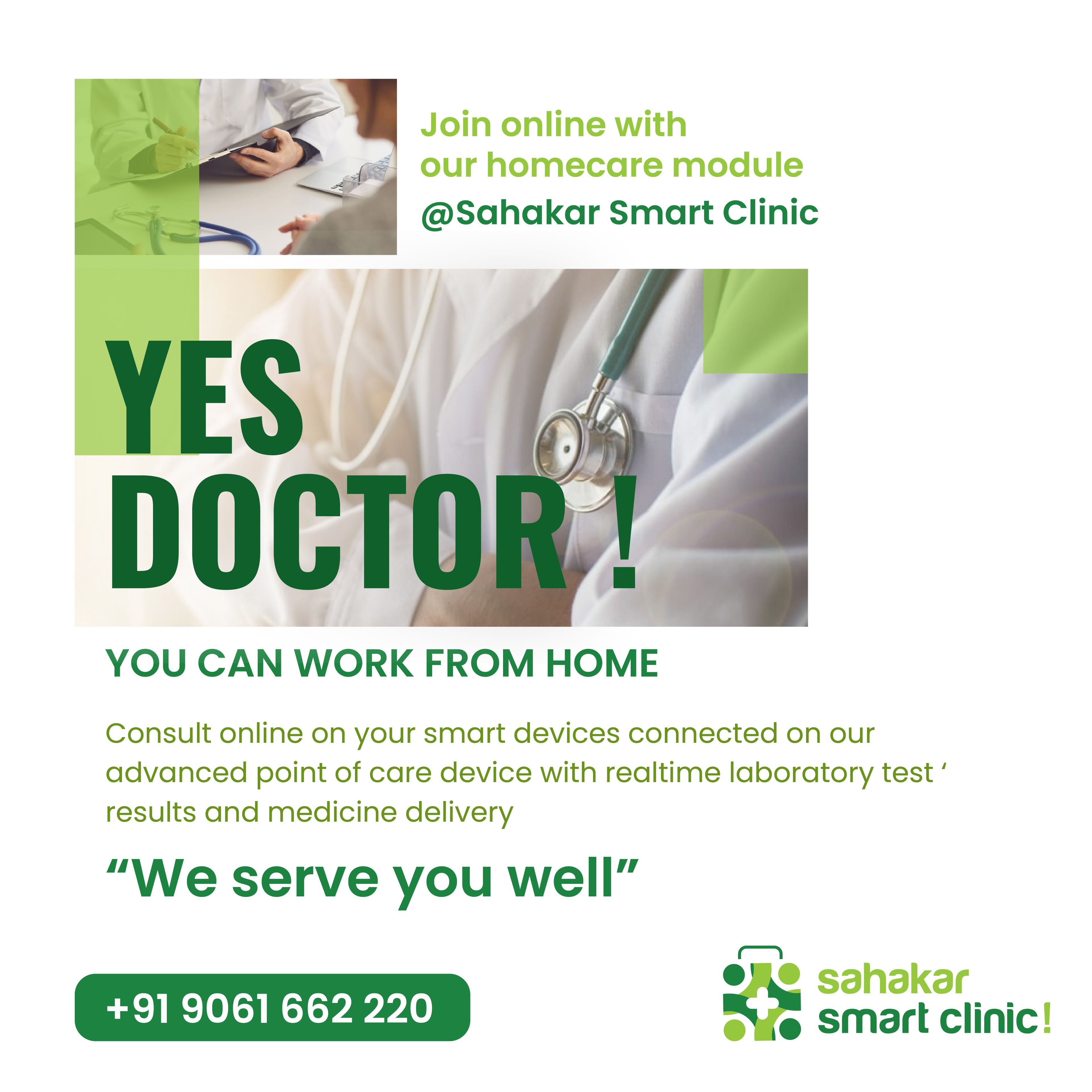
Promotional artwork extends the identity across homecare communication and clinic campaigns, keeping the clinic name, contact details and service messaging easy to spot.


The Result
One clear identity for clinic and homecare.
Sahakar Smart Clinic now has a cohesive visual language spanning its logo, stationery, service information and campaign artwork — a fresh, recognisable system designed to make healthcare communication feel clear and welcoming.
What we delivered
Reputed clients
Brands that trust Dableyu.
From jewellers and cafés to hospitals and fashion labels — a few of the brands we’ve built, launched and grown.
Drag or scroll to explore.










Work with Dableyu
Ready to build a brand people remember?
From strategy to shelf, we engineer brands that stand out in crowded markets and grow with your business.
Start your brand project