
Case Study · Brand Guidelines
Guiding Soothee Sparsh — clear rules for the gentle touch of post-pregnancy care.
01The Brief
One brand, always used the same way.
Soothee Sparsh provides traditional post-pregnancy care services in Kottakkal.
They wanted their centre to feel like a lovely, friendly home where every woman feels self-love, comfort and peace. Our job was to capture that feeling in a clear set of brand guidelines — so the logo, colours and type stay calm, warm and consistent wherever the brand appears.
- 01Stay consistent
One clear way to use the brand, everywhere.
- 02Protect the logo
Rules for sizing, spacing and variations.
- 03Define the palette
Exact colours for print and screen.
- 04Set the type
Typefaces that keep every touchpoint refined.
“The Gentle Touch”
Rest, rejuvenation and peace —
for every mother after childbirth.
02The Logo
A mother at peace, in full bloom.
At the centre of the emblem is the silhouette of a woman sitting in a meditative pose, surrounded by flowing leaves and petals.
Below the emblem, “Soothee Sparsh” is set in a soft, feminine and elegant serif that conveys sophistication and refinement. Together, the logo represents rejuvenation, relaxation and peace — the journey of motherhood.
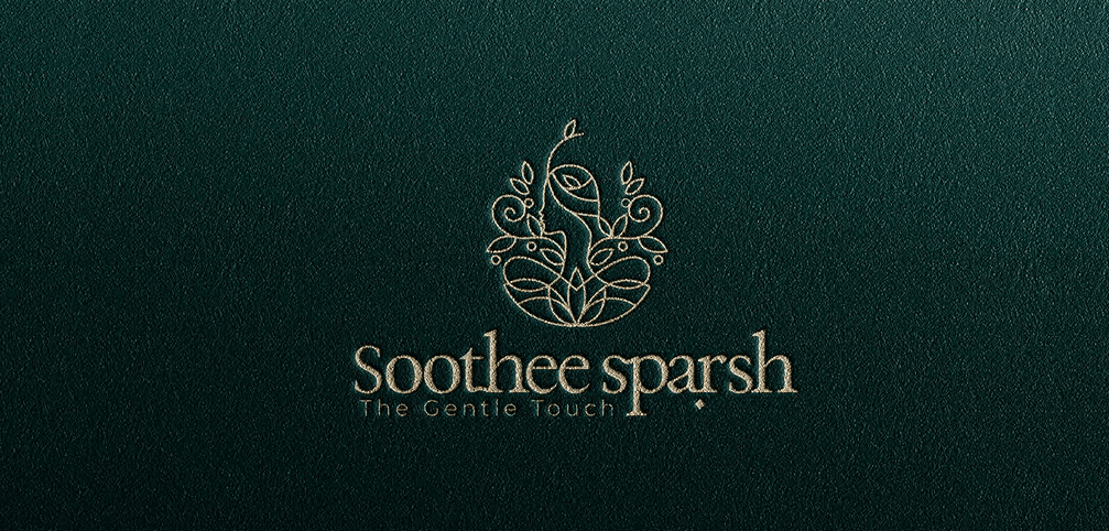
A woman in a meditative pose — calm and self-love.
Growth, nature and traditional healing.
Renewal and rejuvenation after childbirth.
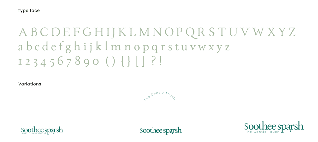
A soft, feminine serif with “The Gentle Touch”.
03Brand Guidelines
Calm, consistent and cared for.
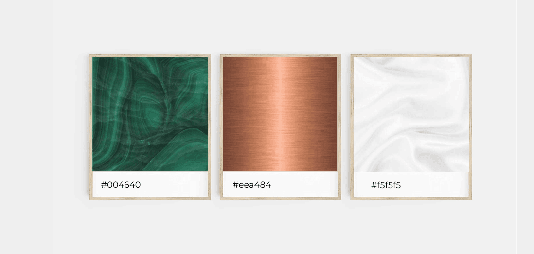
The guidelines set out the colour palette, typefaces and logo variations — so everyone who uses the brand gets it right, every time.
The Result
A post-pregnancy care brand with clear, gentle rules.
Soothee Sparsh now has a complete set of brand guidelines — covering the meditative mother emblem, the malachite and copper palette and its typography — so the brand looks calm, elegant and consistent wherever it appears.
What we delivered
Reputed Works
Brands that trust Dableyu.
From jewellers and cafés to hospitals and fashion labels — a few of the brands we’ve built, launched and grown.
Drag or scroll to explore.















Work with Dableyu
Ready to build a brand people remember?
From strategy to shelf, we engineer brands that stand out in crowded markets and grow with your business.
Start your brand project