
Case Study · Brand Identity
Launching ZappQ — a healthcare app that takes the wait out of care.
01The Brief
Nobody likes waiting — especially when unwell.
ZappQ is a digital queue and appointment platform for clinics and hospitals. Patients book, track their turn and arrive just in time — instead of sitting in crowded waiting rooms.
Health-tech can feel cold and complicated. ZappQ needed a brand that felt fast, friendly and reliable — one that patients of every age, and the clinics that serve them, would trust from the first glance.
- 01Communicate speed
An identity that instantly says quick and effortless.
- 02Feel friendly and human
Warm, approachable storytelling around care.
- 03Build trust with clinics
A professional system hospitals are proud to use.
- 04Stand out on every screen
A bold app icon that's easy to spot on a phone.
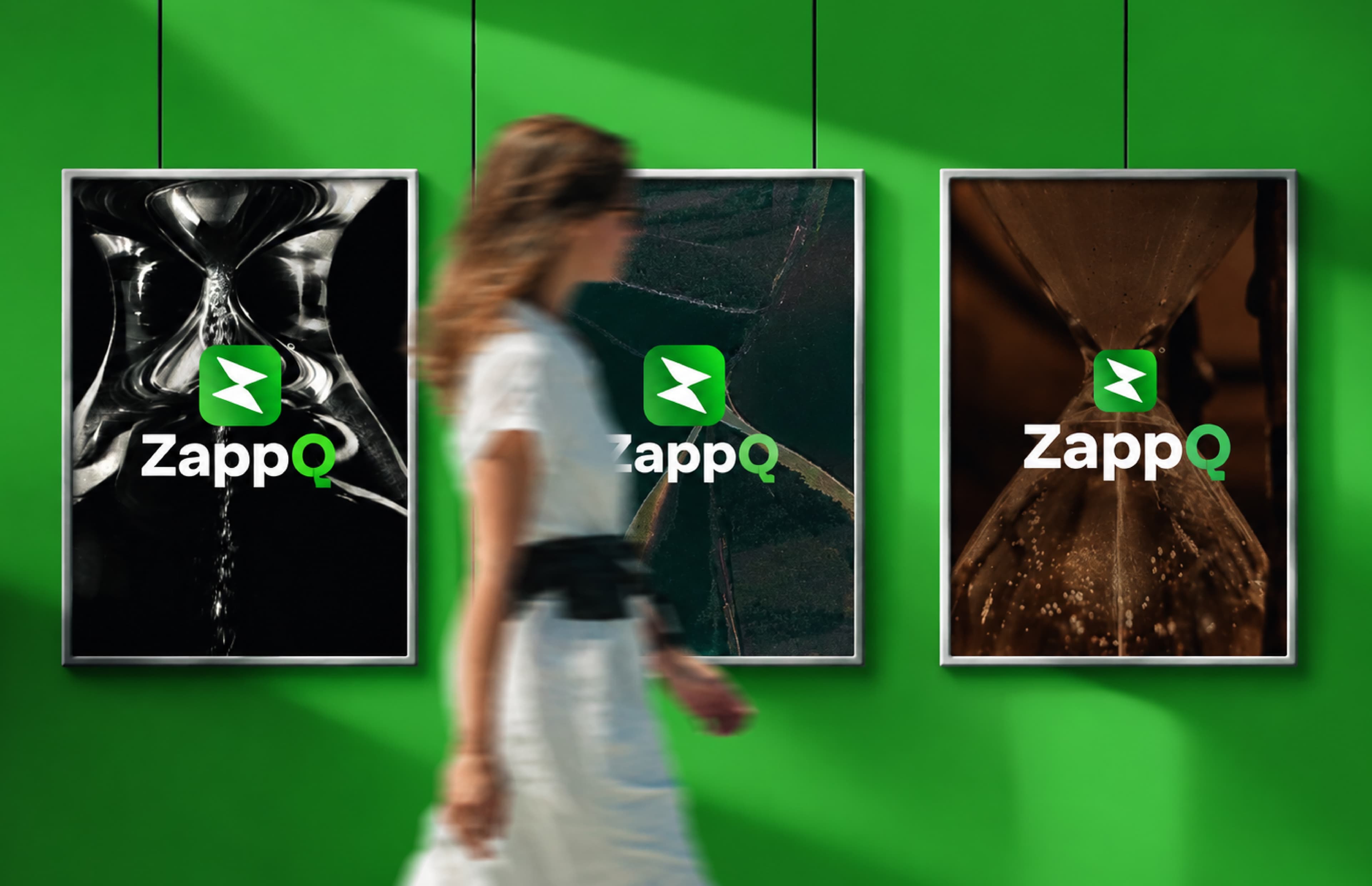
“Time Saved is Care Gained”
For ZappQ, “Time saved is care gained” captures the purpose —
every minute patients don't spend waiting is a minute that goes back into getting better.
02Strategy
Care shouldn't start with a long queue.
Most healthcare apps talk about features. We built ZappQ around a simple human truth: waiting makes people anxious. Removing the wait makes care feel kinder.
That insight shaped the lightning-fast mark, the energetic green and friendly illustrated campaigns that show real moments of care.
Booking and check-in in just a few taps.
An experience anyone can use, at any age.
Real-time updates patients can count on.
Designed around the comfort of patients.
A trusted tool for clinics and hospitals.
03The Logo
A Z that moves at the speed of care.
The ZappQ icon turns the letter Z into two swift, forward-moving strokes inside a rounded square — a symbol of speed and progress that works perfectly as an app icon.
A clean, geometric wordmark with a distinctive Q completes the lockup, keeping it modern and easy to read.

Two angled strokes form a Z and suggest quick forward motion.
A rounded square makes the mark app-ready and instantly tappable.
The open, geometric Q stands for the queue ZappQ makes disappear.
Fast, fresh and dependable — technology with a human touch.
04Stationery & Merchandise
Bold green, everywhere.
We extended the identity to business cards, letterheads, ID cards and merchandise — giving the ZappQ team a confident, unified look on the ground.
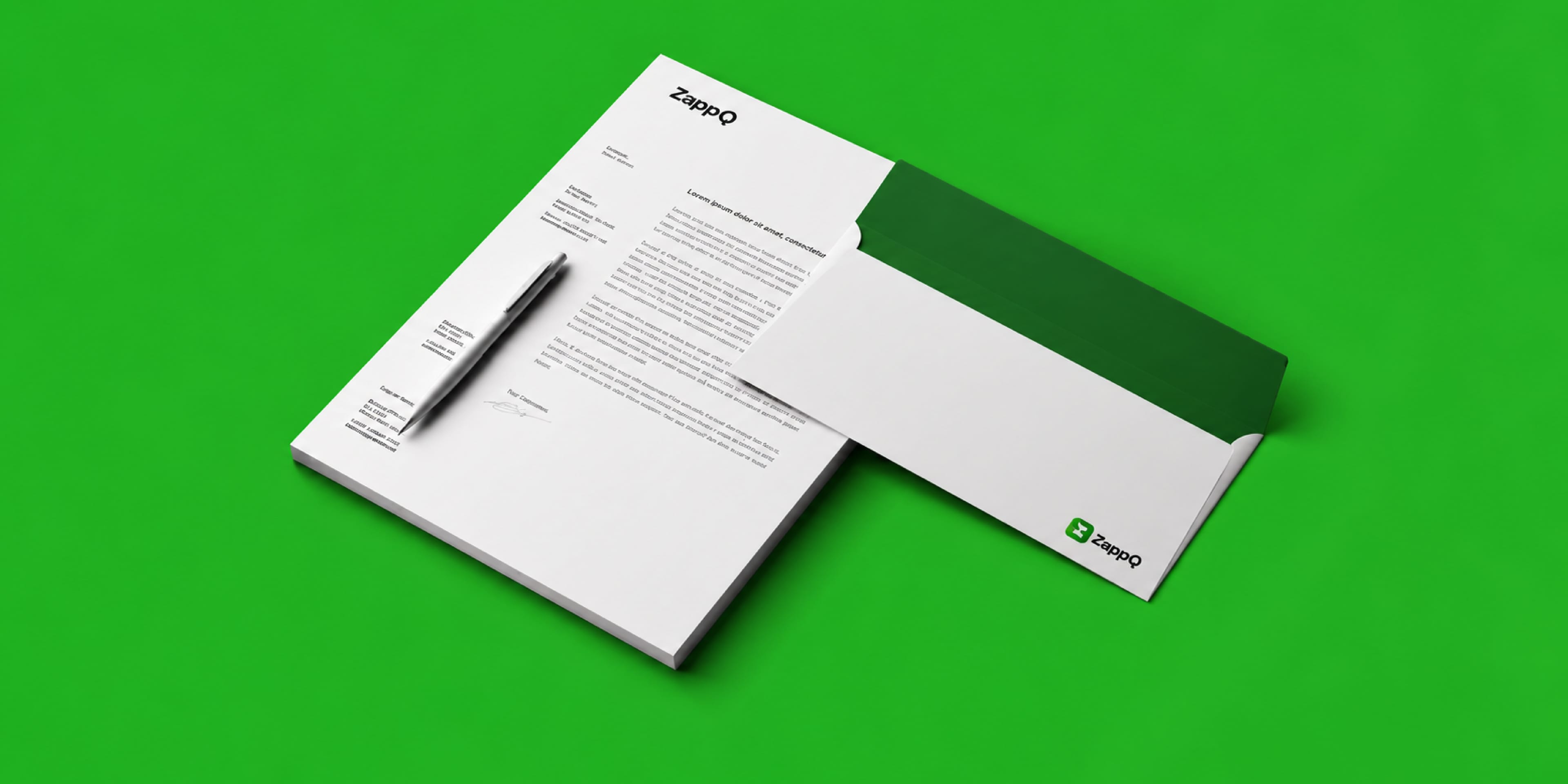
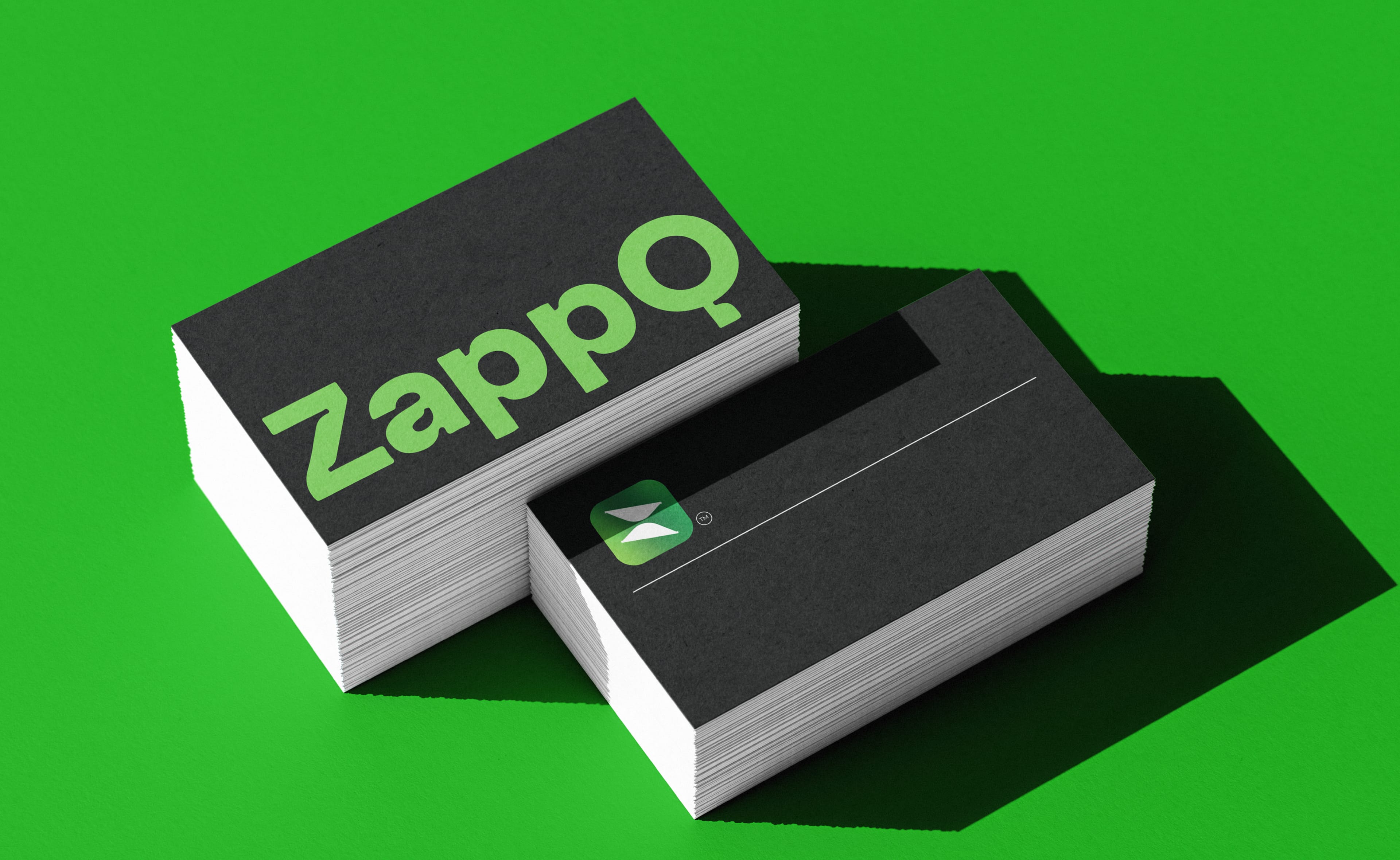
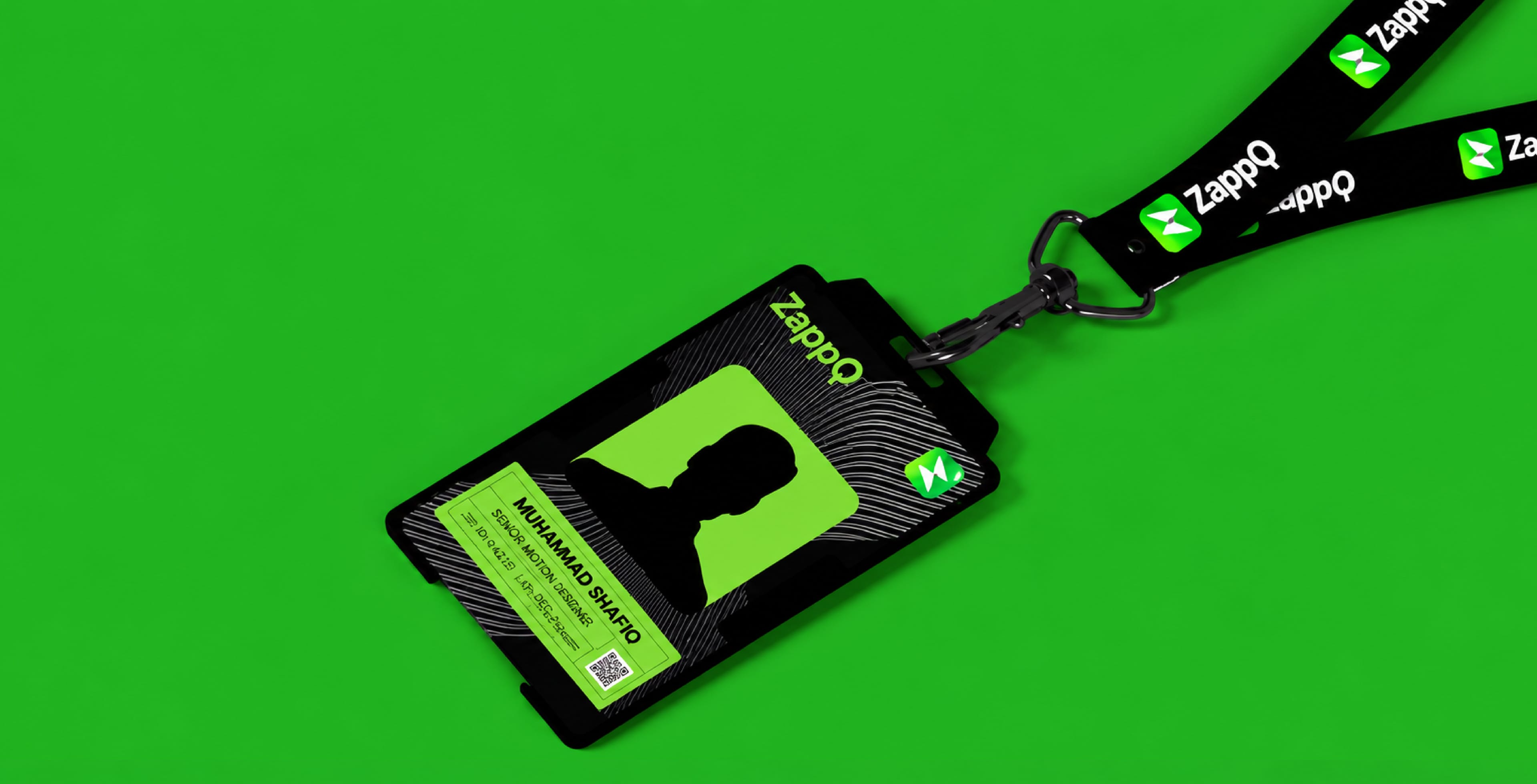
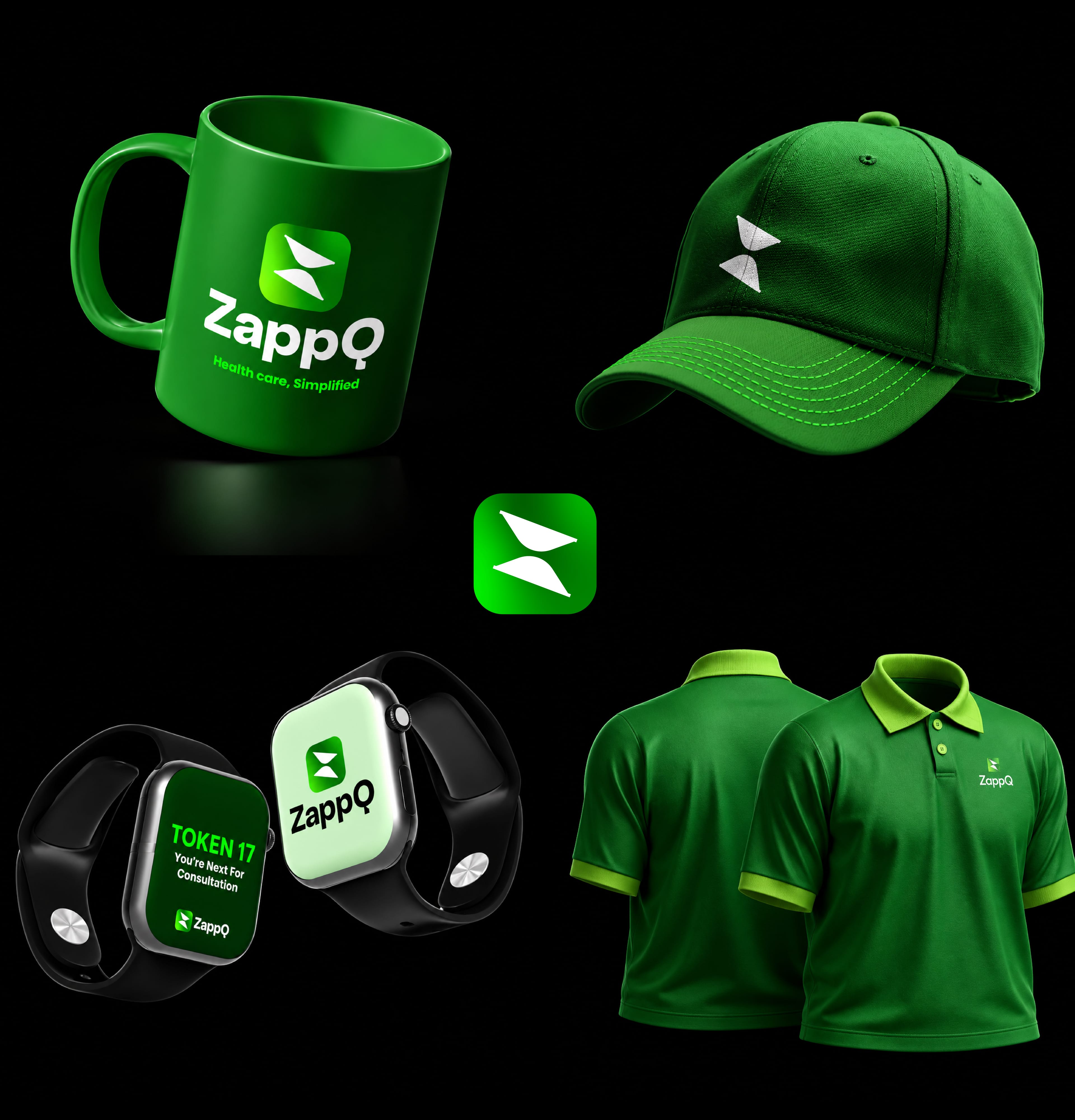
The bright green makes every touchpoint stand out in busy healthcare spaces.
Minimal layouts keep the focus on the icon and wordmark.
Caps, T-shirts and mugs turn the team into ambassadors for the brand.
05Brand in the World
From the app to the commute.
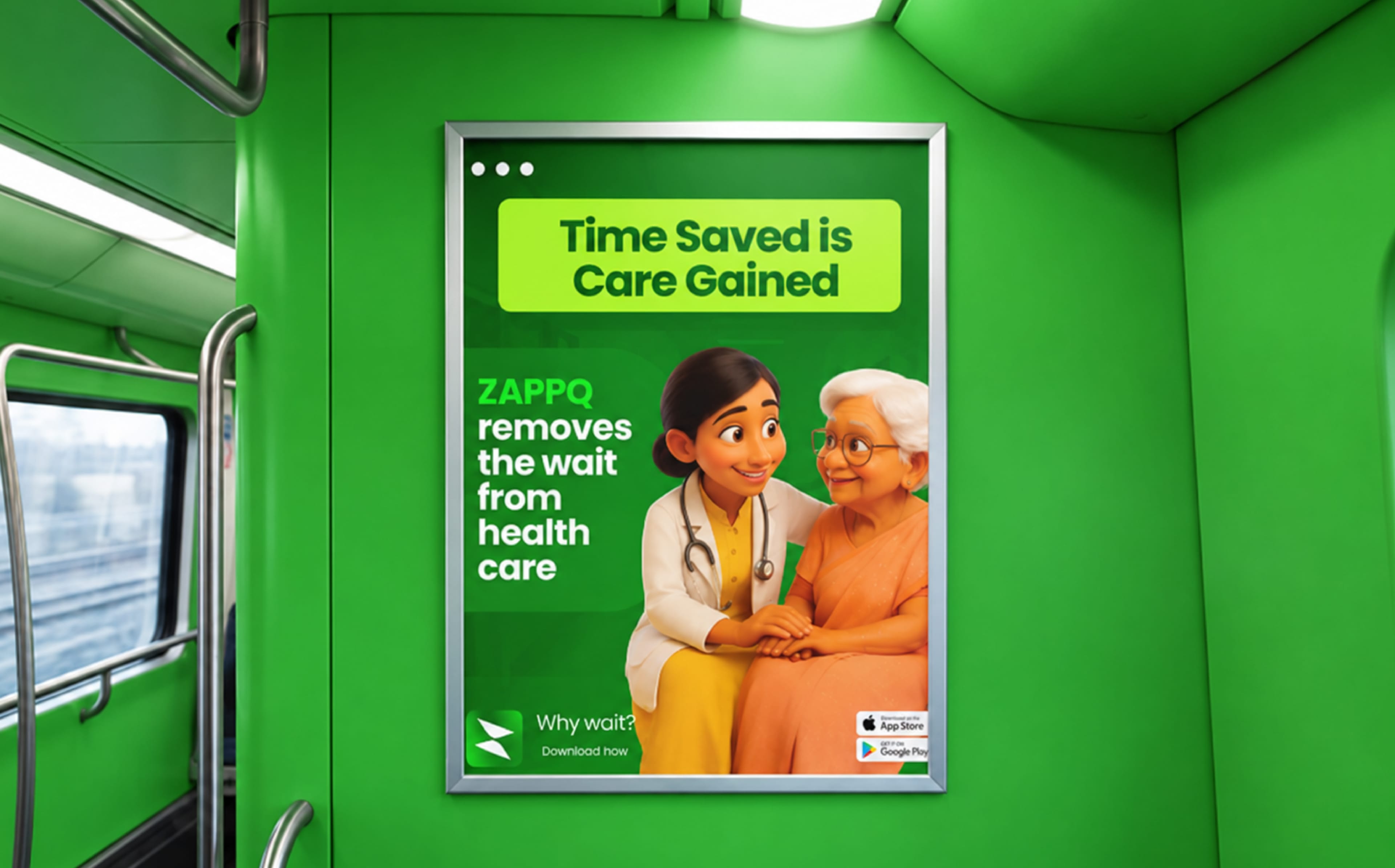
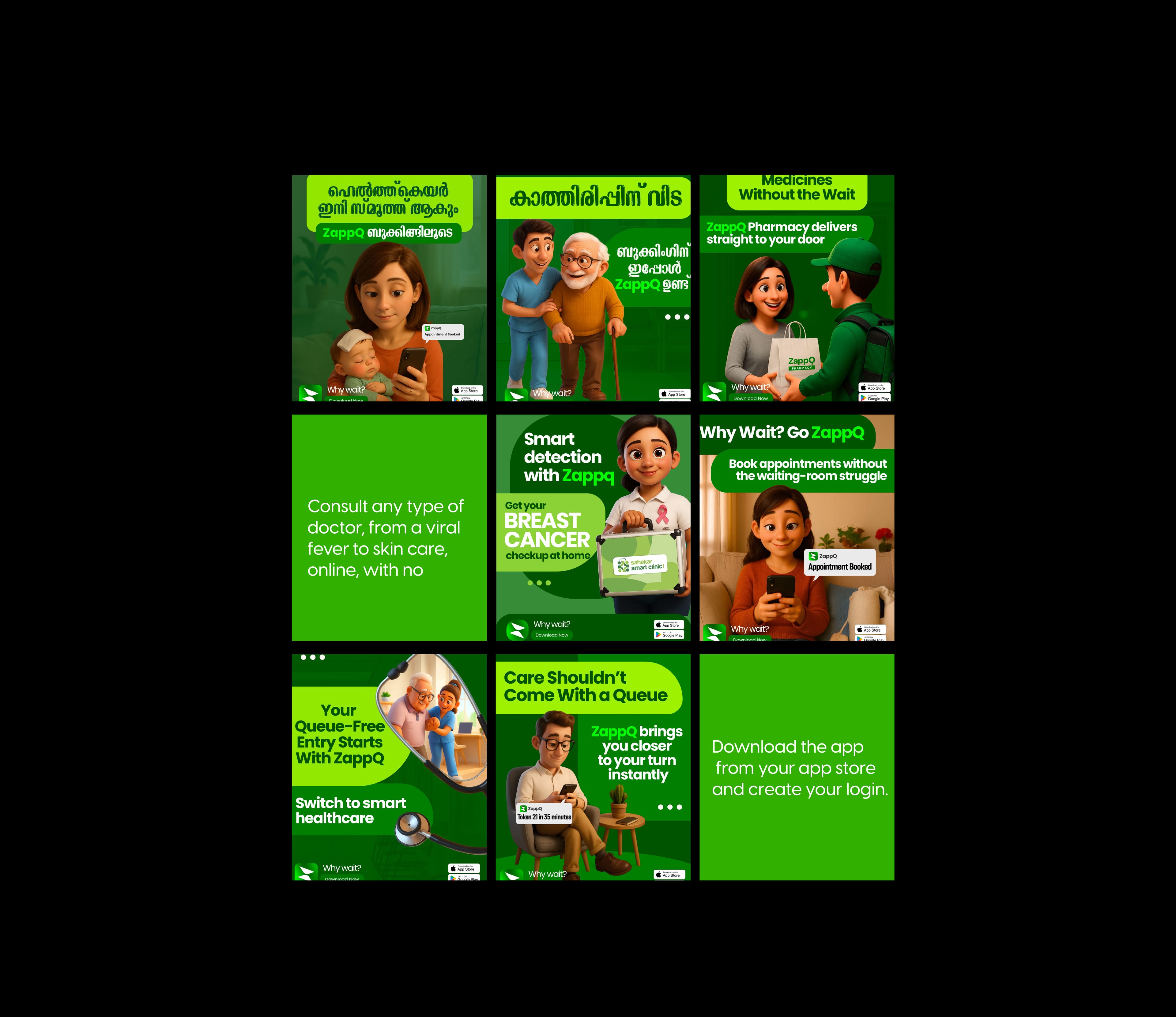
ZappQ launched with transit advertising, poster campaigns and a social series in English and Malayalam — using friendly characters to show how much easier care becomes without the wait.
The Result
A health-tech brand that makes waiting a thing of the past.
ZappQ launched with a bold, friendly identity — a fast-moving icon, an energetic green palette and campaigns that put patients first. It gives the platform the clarity and warmth to win over both patients and clinics.
What we delivered
Reputed Works
Brands that trust Dableyu.
From jewellers and cafés to hospitals and fashion labels — a few of the brands we’ve built, launched and grown.
Drag or scroll to explore.













Work with Dableyu
Ready to build a brand people remember?
From strategy to shelf, we engineer brands that stand out in crowded markets and grow with your business.
Start your brand project